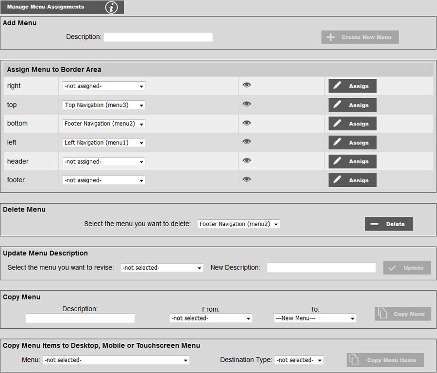
Menu assignment is accomplished through the tool shown below. To add a new menu, enter your choice into the "Menu Type" block. Enter a description for your new menu such as "Main Menu" or "Side Menu" or "Footer Menu" and click add. Then assign your new menu to the border area of your choice. Note: By adding additional border areas, you could assign different menus to different pages through this tool. You can create as many menus as you want, but you can only have up to four different menus on any particular page. Note menus are not assigned to pages, but rather to border areas. The border areas are then in turn assigned to the pages. This makes it a little more cumbersome when trying to figure out how to get a particular menu assigned to particular pages on complicated websites. As a convenience, you can hover the mouse of the eye icon. This will display the list of pages that the border area is assigned to.
You may also prune your menus if a menu is no longer needed by deleting it. You may also change the description of your menus. For example, you may decide to change the stock description of the first CSS menu from "CSS Menu 1" to "Main Menu".
You can copy a menu to to another menu overwriting all styles and menus items, or to a new menu. Simply select the from and to menus, and enter a description. But understand that if you are copying to another menu, all of the styles, parameters and items will be replaced with that of the "from" menu.
You may also copy the items from the any one of the desktop, mobile or touchscreen version of a particular menu, to the desktop, mobile or touchscreen version of the same menu. You obviously must select a different destination type for the source. For instance if you are copying from a desktop menu, you can only choose between mobile and touchscreen.
Desktop menus are generally loaded automatically if on a desktop or laptop computer, and mobile menus are always loaded automatically if on a mobile device. Touchscreen menus are loaded under the condition that the device is not mobile and there is a touchscreen attached to the device such as a kiosk, tablet, or some all-in-one computers. Desktop menus can be oriented vertically or horizontally and can respond to mouse-over (hover) events. Mobile menus are almost always vertical and are usually accessed via a "hamburger" icon. Touchscreen menus may be horizontal and look like the desktop menu, but they cannot have sub menus that rely on hovering over a top-level item to be displayed and selected. (The same is true for the top-level/sub-level relationship with mobile menus.) If you want sub menus on either a mobile menu or a device with a touchscreen, you must not assign a link to the top-level item. The top-level item therefore exists only to group and provide access to the sub levels under it. Here are some examples of such menus:

Above is a desktop menu. The submenu items are displayed upon hovering over the parent top-level item.

Above is a mobile menu which is displayed upon clicking on the "hamburger" icon. 
The top-level item Hosting & Cloud has no link such that tapping on it will not load a new page thus closing the menu and making the sublevel items inaccessible.

Above is a touchscreen menu which looks very much like the desktop menu, but as with the mobile menu, the top-level item Hosting & Cloud has no link such that tapping on it will not load a new page thus closing the menu and making the sublevel items inaccessible.