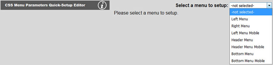
CSS Menu parameters include menu type (horizontal or vertical), position on page, menu item and submenu item size, submenu offset from main items, and proportional vs. fixed spacing. To start, select the menu you want to position as shown below:
The tool shown below will appear. Select menu layout (vertical or horizontal with fixed width or variable width). A fixed width menu will span to the width you set (if possible) under Menu Width. A variable width menu will expand and contract based on the total number of menu items and their sizes in characters. You will also need to set the offset from any two of top, left, bottom or right.
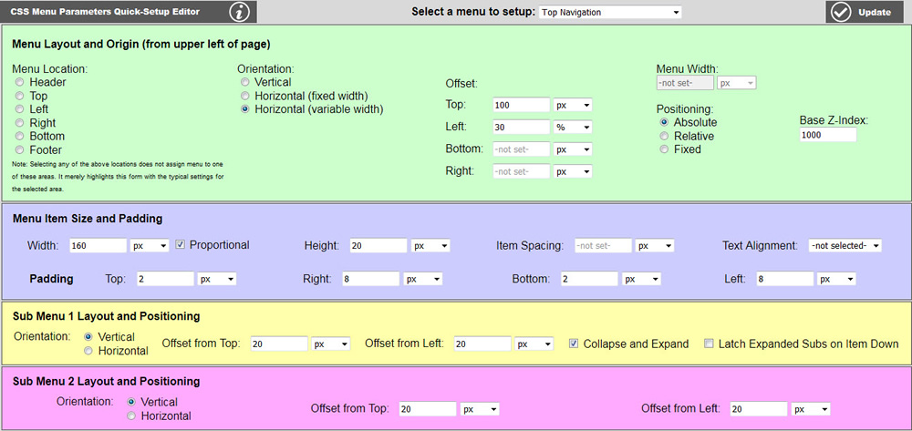
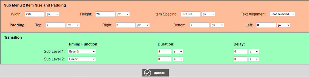
Next set the menu item and submenu item widths, heights and paddings. You can accept the defaults and tweak based upon visual feedback from your live view of a page. By default, the text will align to the left of a menu item, but you may override this using the text alignment. Proportional spacing causes the menu item width to change size based on the number of characters for each item. This is often useful for horizontal menus, but rarely of any use for vertical menus. Sub Menu Layout and Positioning determines the offset that the menu item appears from the next higher up menu item. You may also specify whether each menu level is displayed vertically (default) or horizontally. You will need to tweak these values as well if you intend to have sub menus. Collapse and Expand causes sub menus to be hidden until the mouse is hovering over the main item. Upon mouse over, the sub menu appears. This is the default setting. If you would like the sub menus to always be displayed, uncheck this box. This is sometimes desirable for vertical menus, but is not likely to be useful for horizontal menus.
Latch Expanded Subs on Item Down causes an entire tree branch to stay visible upon any of the pages within that tree being selected whether a top level or a sub level. Click Update to save your changes.
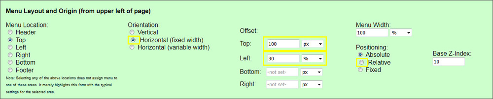
Selecting a location under Menu Location unto itself does not actually do anything other than highlight suggested fields that should be filled in if you plan on assigned (or have already assigned) this menu to that area. Clicking a location under Menu Location suggests whether the menu should be Horizontal or Vertical, what two coordinates should be used to position the menu, and whether or not the menu should use Absolute or Relative positioning. Obviously, header, top, bottom and footer menus are typically horizontal, and left and right menus are typically vertical. Also it is best to reference header, top and left menus from the top-left corner, bottom and footer menus from the bottom-left corner, and right menus from the top-right corner.
Absolute vs. relative positioning is suggested for each of the area selections, but this is not as much tied to menu location as the other settings. In some cases, absolute positioning may work better where relative was suggested. Absolute positioning is easier to setup and maintain because the menu will be placed exactly the distances you set in the offsets from the corner of the container you have chosen. Note that menus in the footer and the header are located in the whole page body as the container, whereas menus in the top, left, bottom or right are located in the wrap div which contains the top, bottom, left, right and content areas. Note that the header is above the wrap div, and the footer is below the wrap div, and both of these areas span the width of the entire page. Typically, the wrap only spans a specified width of the page and is usually centered. This means that if you want your header or footer menu to stay lined up with the page content, you will need to do more things to get it to behave. (More on this below.)
Relative positioning has some advantages over absolute positioning that might be useful. An absolutely positioned menu will not take up any space on the page. If you do not set the height of the area you are positioning your absolute menu in, then the area you have that menu in may not have enough space for your menu (or possibly no space at all if no other content in that area) and your menu could be hovering content in other areas. Relative positioning will cause the menu to occupy space in the area you assign it to. Thus you may not even need to specify a height for that area in CSS. In will also push content in the area to the left or below the menu as space is required for the menu. Thus is is not possible for your menu to be hovering over content. It will simply move your other content out of the way as needed. One of the downsides to relative positioning is that the location of the content in the same area may impact the location of your menu making it more difficult to get it to stay to a specific location.
A menu assigned to the header will be located inside of a div with the ID of #header, and a menu assigned to a footer will be located inside of a div with an ID of #footer. Using the CSS editor, give which one or both of these divs to the same width that your #wrap, and set left and right margins to auto, and position to relative.
Note that all length parameters can have units other than pixels specified. Pixels (px) are generally the most used units; however, percent (%) may be more desirable for responsive websites.
Transitions may be setup independently for sub-level 1 and 2. (Sub levels 3 thru 5 inherit sub level 2 settings.) The transition direction (top-to-bottom or left-to-right) is selected automatically depending on orientation of top level and sub levels, i.e. if horizontal top level and vertical sub level 1, then sub level 1 menu expands top-to-bottom. If vertical top level and vertical sub level 1, then sub lever 1 menu expands left-to-right. Timing function, duration and delay are all user selectable.