Before cell phones and tablets became ubiquitous, it was not only OK, but good to design websites to fixed dimensions with statically sized images. But now that there are more people accessing the web thru mobile devices (smart phones and tables) than desktops and laptops, websites must be able to dynamically change the image dimensions to meet the screen size. Furthermore, it is often required to swap out landscape for portrait formatted images as so many mobile devices are viewed in the portrait mode. Such image handling capability is known as responsive images. It is possible to accomplish responsive images using either JavaScript or CSS. But both of these methods are unacceptable compared to using the new HTML5 responsive image tags. In the case of JavaScript, the browser must first not have JavaScript turned off due to add blockers or by corporate security policies. One could have a default image, but a second image would need to be downloaded upon running the JavaScript device detection routine. Between loading the JavaScript, running the routine, and possibly downloading another image yet, page load speeds will not be optimal. Since above-the-fold page load speeds are critical to natural search engine optimization, this is unacceptable. In the case of using CSS, the HTML needs to be loaded, then the default image, then the CSS, then only after the CSS is loaded will it be processed to determine which is the correct image for the screen format to load, thus an additional image may require loading. Once again, page load speed is adversely affected. But by using HTML5 responsive image tags, only the correct image will be loaded right away with a minimum of processing. But as you will see later on, building the necessary HTML and creating the image collection can be extremely tedious. That is why we have created this Responsive Images plugin to greatly automate the process with only a few parameters required from the user. You may purchase the Responsive Images plugin here:
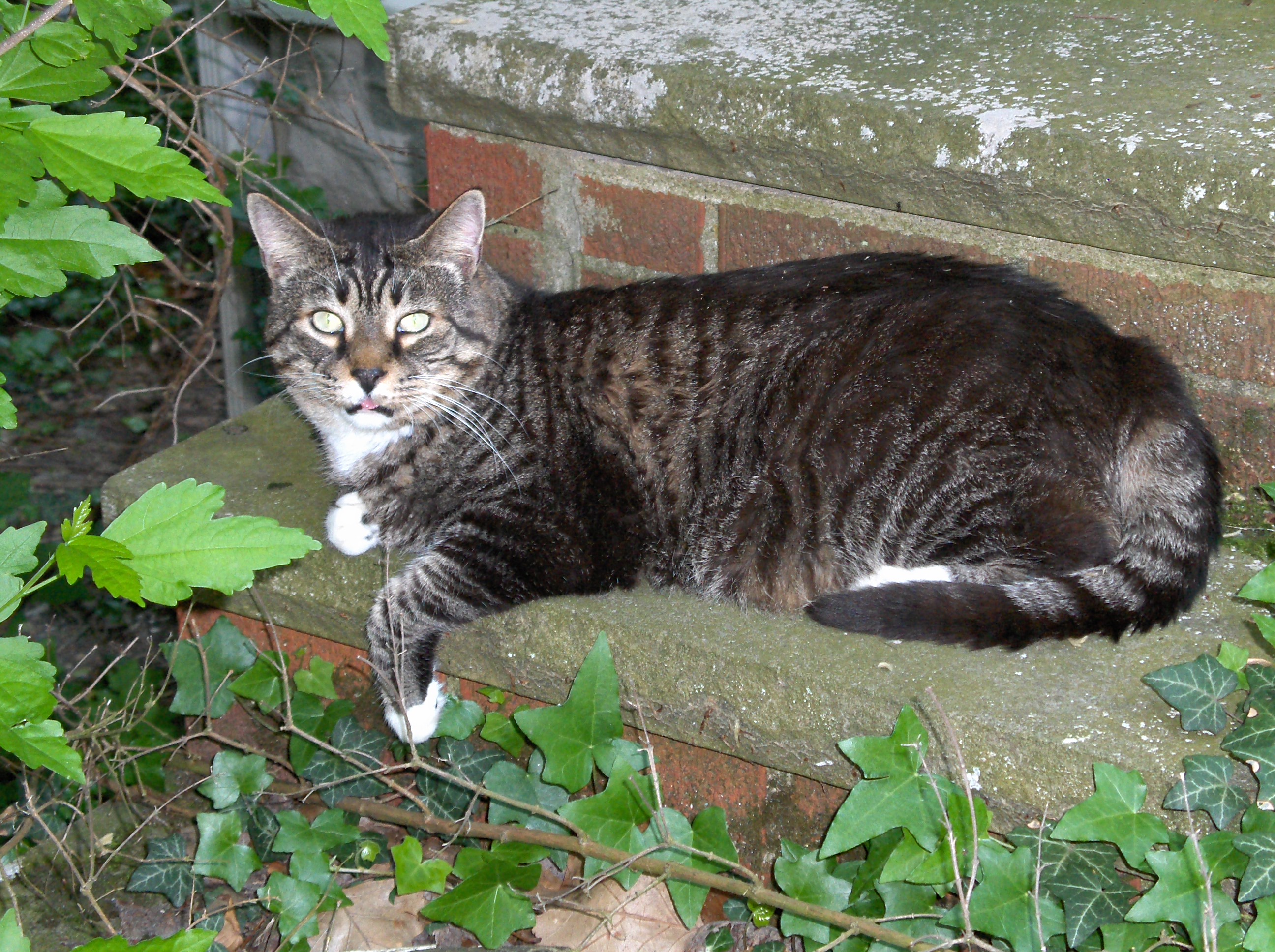
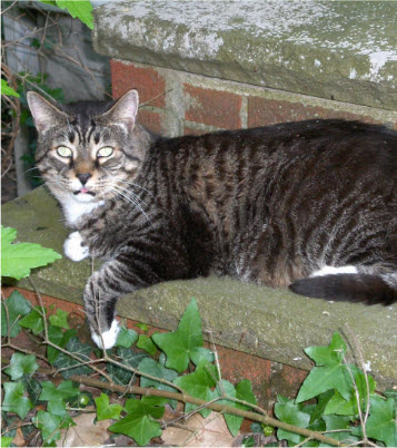
To start with, here is an example of working with a huge picture of a cat right out of a high-resolution digital camera.
If one were to upload this cat image using the file manager in the Breeze Website Builder™, it would create a basic image tag and automatically:
<p><img alt="Cat" src="/images/HPIM1256.JPG" style="height:1396px; width: 2592px;" /></p>
Since we don't want a static image we could remove the inline height and width style:
<p><img alt="Cat" src="/images/HPIM1256.JPG" /></p>
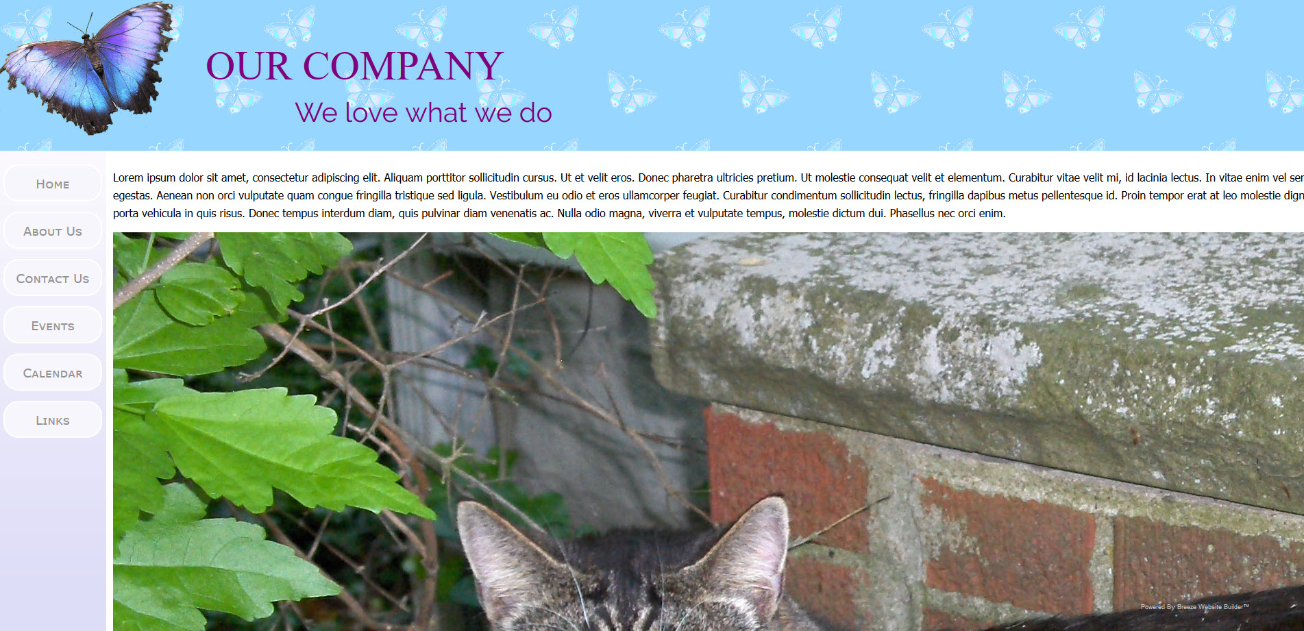
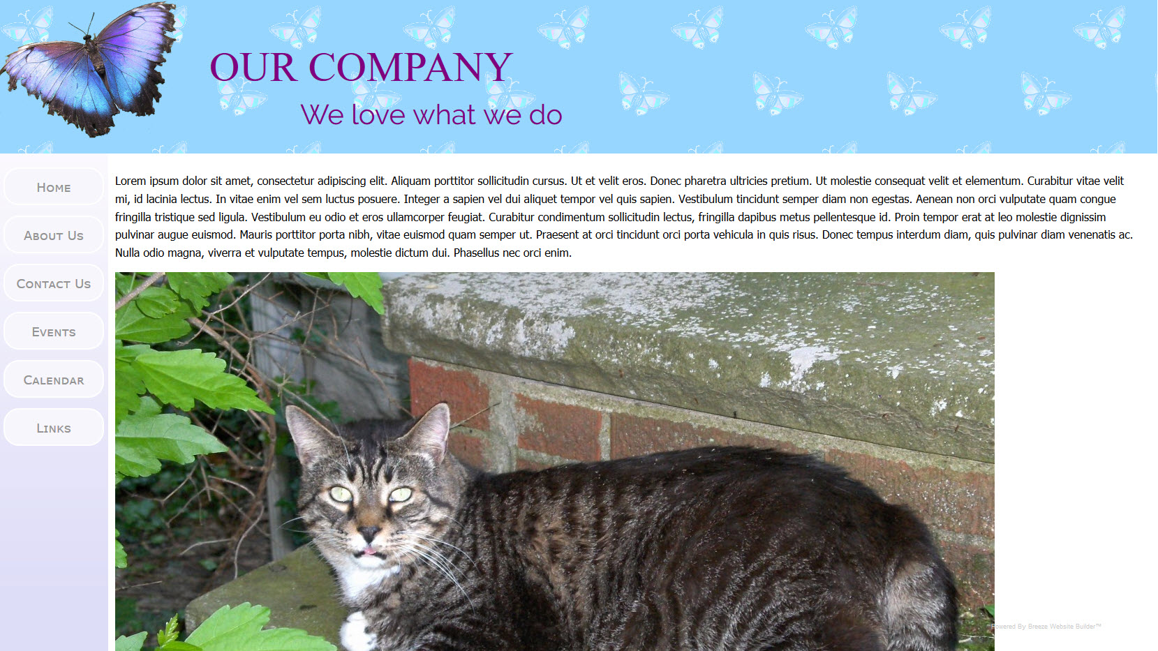
But the result would be the same anyway. Below is a screen snap of the test site on a desktop computer with a screen resolution of 1920px X 1080px. Note that the picture is allowed to expand the page out horizontally:
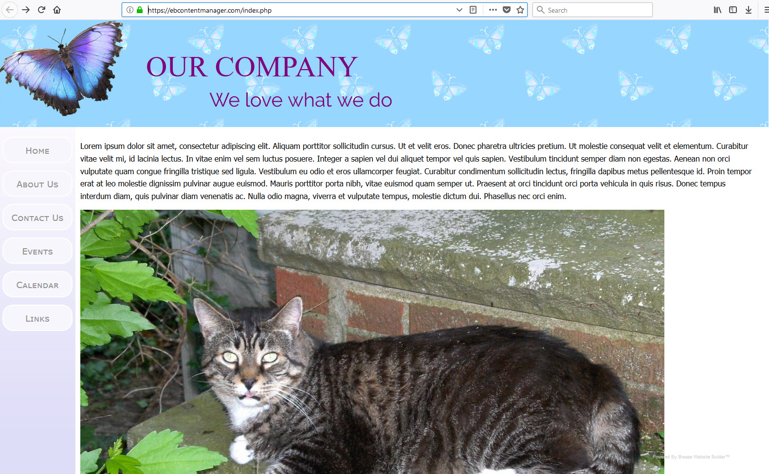
Here is that same page shown on a cell phone with a screen width of 1080px:
Note that the cell phone automatically zooms out to accommodate the picture which is too wide. Tapping on the screen will set the view at 100% zoom:
We could attempt to correct the above issues by statically setting the picture width to accommodate the cell phone. Including margins for the paragraph that the image is in, this would be about 950px. The code would is shown below:
<p><img alt="Cat" src="/images/HPIM1256.JPG" style="height: 710px; width: 950px;" /></p>
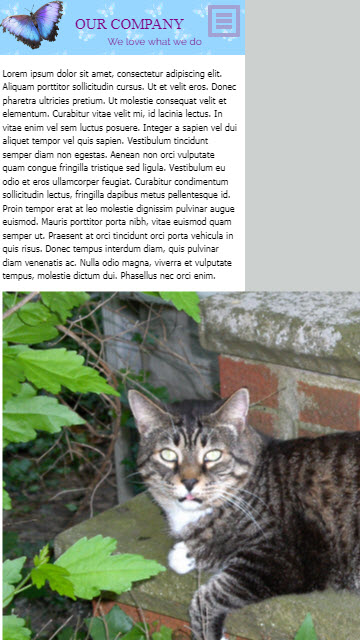
This would at least shrink the image to fit the desktop without horizontal scrolling:
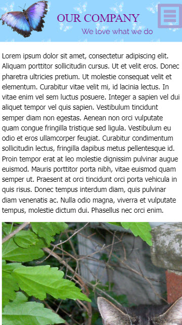
It also fixes the problem of the cell phone zooming out to accommodate the image width:
But the picture no longer fills the available width on the large 27" monitor. Also, we might want to make the image more portrait so that the cat's face is easier to see on a cell phone.
By clicking on the Responsive Images button the responsive images management console will appear:

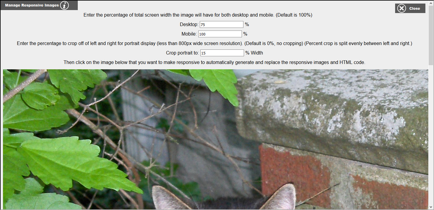
By default, both the desktop and mobile widths are set to 100% and the crop to portrait is set to 0% (no cropping). Note: All non-background images will appear below the settings edit boxes. Just fill in your desired settings and click the image below that you want to make responsive. With a little bit of testing, I have come up with a desktop width of 75% to accommodate the left border area, a mobile width of 100% since left border area has been removed, and cropping to portrait of 15% off of the left and right. The resultant code is show below:
<p><picture>
<source srcset="/images/resp/HPIM1256_240_portrait.JPG" media='(max-width: 240px)'>
<source srcset="/images/resp/HPIM1256_320_portrait.JPG" media='(max-width: 320px)'>
<source srcset="/images/resp/HPIM1256_480_portrait.JPG" media='(max-width: 480px)'>
<source srcset="/images/resp/HPIM1256_640_portrait.JPG" media='(max-width: 640px)'>
<source srcset="/images/resp/HPIM1256_800_portrait.JPG" media='(max-width: 800px)'>
<source srcset="/images/resp/HPIM1256_1024_portrait.JPG" media='(max-width: 1024px)'>
<source srcset="/images/resp/HPIM1256_864.JPG" media='(max-width: 1152px)'>
<source srcset="/images/resp/HPIM1256_960.JPG" media='(max-width: 1280px)'>
<source srcset="/images/resp/HPIM1256_1050.JPG" media='(max-width: 1400px)'>
<source srcset="/images/resp/HPIM1256_1080.JPG" media='(max-width: 1440px)'>
<source srcset="/images/resp/HPIM1256_1200.JPG" media='(max-width: 1600px)'>
<source srcset="/images/resp/HPIM1256_1260.JPG" media='(max-width: 1680px)'>
<source srcset="/images/resp/HPIM1256_1440.JPG" media='(max-width: 1920px)'>
<source srcset="/images/resp/HPIM1256_1920.JPG" media='(max-width: 2560px)'>
<source srcset="/images/HPIM1256.JPG">
<img src="/images/HPIM1256.JPG" alt="Cat">
</picture></p>
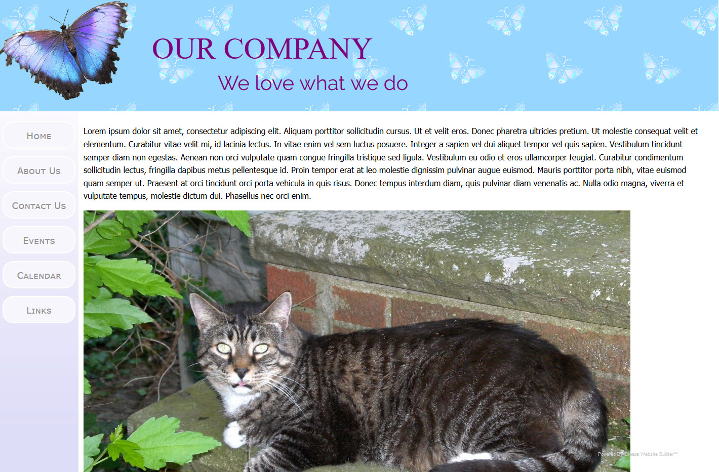
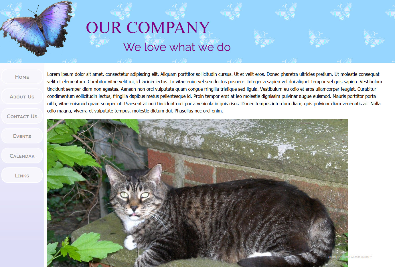
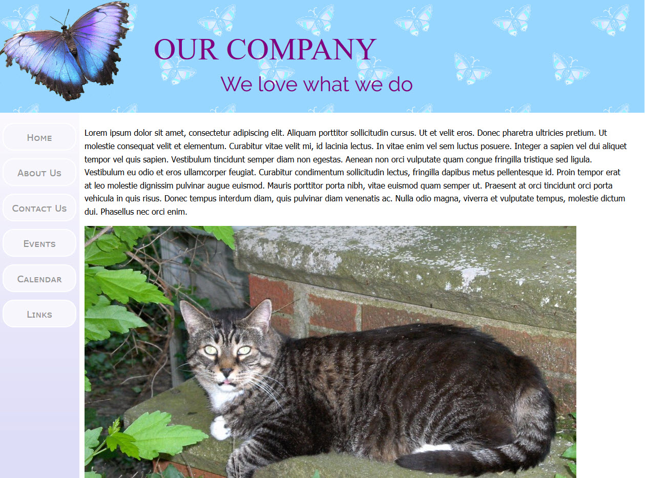
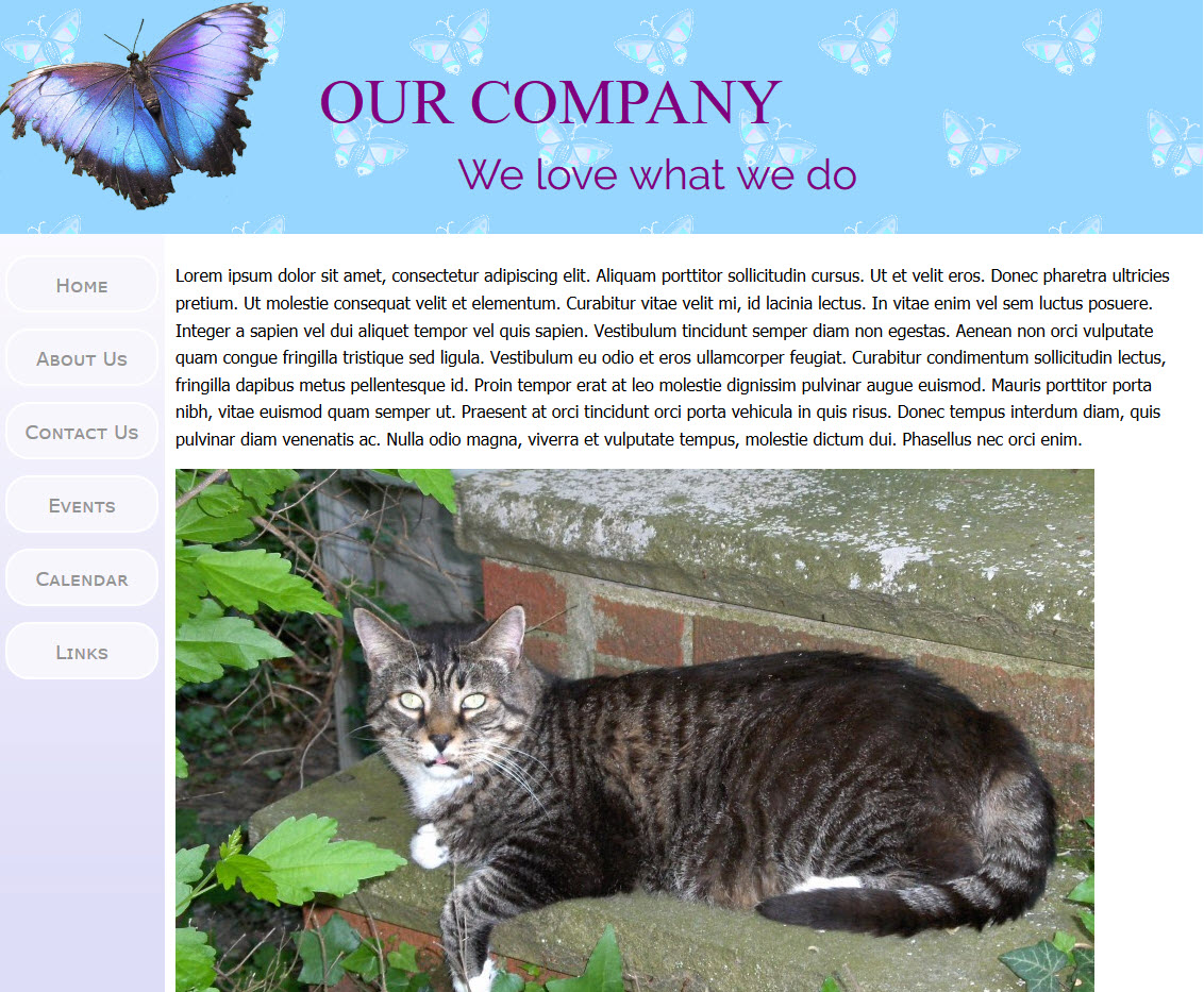
In the above code, you can see that for all media types of max-width of 1024px and less, a portrait image is used. For anything greater than 1024px, the landscape image is used. Also, new images were created to match the screen size. For mobile it is a one-to-one match up. For desktop, the image is scaled to 75% of the media type. Also note that for legacy browsers that do not no of the <picture> tag, the legacy <img> tag is used instead with the original un-scaled image. The result is the series of screen snaps for each of the media screen widths as shown below. You will see how the picture size fills the content area without spilling over causing horizontal scroll:
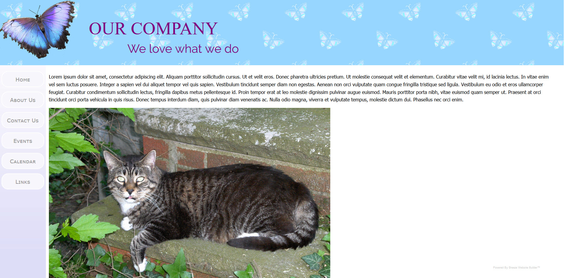
1920 X 1080
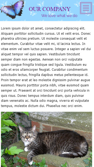
1080 X 1920 Portrait
1680 X 1050
1600 X 1280
1440 X 1080
1400 X 1050
1280 X 1024
1152 X 900
1024 X 768
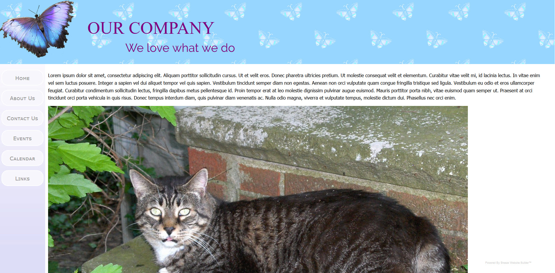
Note that the portrait image is used even on desktop for screen widths of 1024px or less. But this compromise to get portrait on a cell phone is not likely to be much of a problem as desktop (or laptop) computer screens of only 1024 X 768 resolution are archaic by today's standards.