As of version 5.4.0, The page layout files include mobile device detection. This detection performs three actions to aid in mobile development:
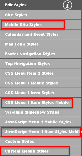
The style sheet used for rendering the page switches from site.css to site_mobile.css. You can editing these files either with the styles editor, and/or the custom styles editor. There are also style sheets for mobile menus as well.
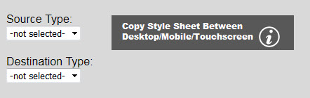
To get started quickly, you can copy the desktop style sheets to the analogous mobile style sheets. To do this, click on the button as shown below:

(Note: This feature is only available when logged in with admin privileges.) You will see the console and shown below:
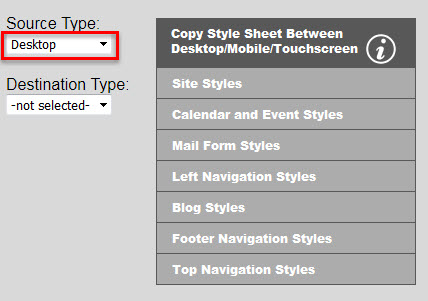
You will need to select the source type (usually desktop on first pass) as shown below to populate the list of styles sheets:
Next you will need to select the destination type (typically mobile on first pass) as shown below.
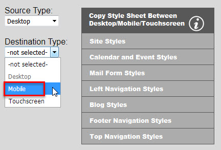
Then simply click the style sheet button and after a couple of warnings, the source style sheet will be copied into the destination style sheet. If the mobile or touchscreen style sheet does not exist, it will be created. Note: Any existing styles in the mobile or touchscreen style sheet will be erased. Note: Desktop is considered the default set of style sheets. If the analogous mobile or touchscreen style sheets are non existent or empty, the web pages will gracefully degrade to the desktop style sheets.
Pages created in the Breeze Website Builder automatically detect whether or the device is a mobile device (cell phones, maybe some tablets), and whether or not the device has a touchscreen (all mobile devices plus tablets, kiosks, same laptops and some all-in-one computers). If neither the is_mobile flag or the is_touchscreen flag are set, then the desktop style sheets will be loaded. Note that desktop is also considered the default styles if either mobile or touchscreen styles are available for either of these two device types. If the is_mobile flag is set then the mobile style sheets will be loaded if available, otherwise the desktop style sheets will be loaded as default. Note: touchscreen style sheets will NOT be loaded either way if the is_mobile flag is set. If the is_touchscreen flag is set then the touchscreen style sheets will be loaded if available, otherwise the desktop style sheets will be loaded as default.
Tip: Use the length unit em instead of px or % for text and other things. Pixels are much tighter on a mobile device to get image sharpness in a small package. Thus it is more difficult to get pixel sizes to work across many mobile platforms compared to ems.
You can turn off table structures within the page layout file. Note: You can also turn off table structures when being viewed with office devices if you want. For more information on turning off table structures click here.
The built-in mobile detection within the page was kept intentionally very simple to avoid loading down the pages with a lot of browser/platform-detection JavaScript that may not be used. It is a very simple go/no-go gage to determine is mobile or is not mobile. There is a JavaScript var in the head of every page named is_mobile. If mobile device, this var is set to true, otherwise false. You can use this var to perform different actions in JavaScript or JQuery based on viewing platform. If you want more fine tuning for different devices, you may of course add JavaScript and JQuery referencing to a popular browser/platform detection script in the head of the pages using the head code editor. You may also create new style sheets using the @media filter to specify which CSS is loaded for any particular screen size range. You can build truly responsive websites using @media along with the flex attributes in the CSS editor.
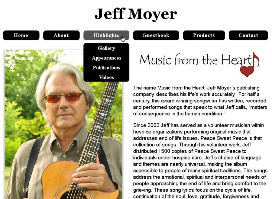
One of the most important considerations for mobile-capable sites is how the menus will look and work on a mobile device. Fortunately, the Breeze Website Builder's CSS menu system offers a great deal of flexibility in mobile design. Below is an example of a website shown on a desktop or laptop computer:
The same site on an Android phone looks like the image below:

Note the "hamburger" icon in place of the menu. When this icon is clicked, the menus display as shown below:
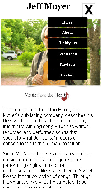
You can see that the mobile menus have the same look and feel as the the desktop version, but they are shown vertically instead of horizontally. The hamburger icon is replaced with the close menu icon. To do this, simply add this code to head for your pages using STYLES & HEAD CONTENT/Manage Head Code/Edit Head Code:
<script>
     var hamburger_menu_num = 1;
     var max_menu_height = 640;
</script>
<script src="scripts/mobile_menus.js"></script>
The one value you may want to adjust to improve the animation for you site is max_menu_height. Simply set max_menu_height to the pixel height of your expanded menu. You may copy and paste this code into the default head for your site.
Set hamburger_menu_num to the menu number of the menu that should be used when hamburger icon is clicked, i.e. 1 for menu1_mobile, 2 for menu2_mobile, etc. as you have assigned in MENUS/Manage Menu Assignments. Adjust max_menu_height to the expanded height of your menu as mentioned above. If not assigned, the default for hamburger_menu_num is 1, and for max_menu_height is 640.
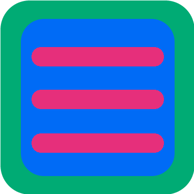
Below are the "hamburger" icons and the close icons. You can download these images for your site if you wish. Whatever hamburger icon you decide to use, name it menu-icon.png and save it as a PNG file. Also for the close hamburger icon, name it menu-close-icon.png and save it as a PNG file. Upload both images to the images folder.
Put the following code into the header (or sometimes the top) of your pages using CONTENT/Manage Border Areas/Edit Border Areas:
<div id="show_hide_mobile_menu_btn" onclick="ShowHideMobileMenu();">
   <img alt="Show/Hide Menu" src="/images/menu-icon.png" id="show_hide_mobile_menu_img" />
</div>
This will place the hamburger icon at the top of your page with the appropriate on-click code for expanding and collapsing your mobile menu and swapping the icon image to show state of menu. Create the ID show_hide_mobile_menu_btn using the class editor and set the CSS to position your hamburger icon. Add this class to both the desktop and the mobile menu style sheets, i.e. menu1 and menu1_moblie. For desktop you will simply want to hide the icon, thus the CSS is simply:
#show_hide_mobile_menu_btn {
     display: none;
}
For mobile you will need to dispay and position the icon. Thus CSS will look something like:
#show_hide_mobile_menu_btn {
   display: block;
   position: absolute;
   top: 5px;
   right: 20px;
}
Note that at a minimum, you must set the display to none for desktop styles. This ensures that the hamburger icon is hidden when viewing on a desktop or laptop computer. Other CSS that you may want to include for mobile styles are position to absolute, top and left or right.
You will also need to hide the menu div initially for mobile devices. To do this, in your mobile menu style sheet, add to the CSS for your menu div as follows (using the appropriate menu number suffix):
#menu_div1 {
	.
	.
	.
	height: 0px;
   	overflow: hidden;
}
All together, the CSS for your menu div will look something like:
#menu_div1 {
	position: absolute;
	display: block;
	top: 150px;
	right: 0px;
	width: 400px;
	z-index: 100;
   height: 0px;
   overflow: hidden;
}
You can also have a left or right side menu in addition to a top menu that expands horizontally instead of vertically.. (It is also possible to have your main flyout from the side.) For an additional side menu to the main top menu, you will need another button.

The code for this button is as follows:
<script>
 function ShowHideMobileMenuHorizontal()
 {
  expand_horizontal = true;
  top_max_menu_height = max_menu_height;
  max_menu_height = 400;
  top_hamburger_menu_num = hamburger_menu_num;
  hamburger_menu_num = 2;
  ShowHideMobileMenu();
 }
</script>
<div id="horiz_show_hide_mobile_menu_btn" onclick="ShowHideMobileMenuHorizontal();">
  <img alt="Show/Hide Menu" src="/images/horiz-menu-icon.png" id="horiz_show_hide_mobile_menu_img" />
</div>
You will need icon images for horiz-menu-icon.png and horiz-menu-close-icon.png. Note that wherever you see "height" it will actually be a "width" in the horizontal mode. Just set max_menu_height to the width of your flyout menu, and hamburger_menu_num to the menu number of the side menu. Note that flyout direction will be the opposite of the menu positioning. i.e. a menu on the right side would would be positioned from the top-right corner. This menu will expand going left. Likewise, a menu on the left side is positioned from the top-left corner will expand going right.
If simply want to have your main menu expand horizontally, you do not need any code for the second button. You simply need to modify the top-button code as follows:
<script>
     var hamburger_menu_num = 1;
     var max_menu_height = 640;
	  expand_horizontal = true;
</script>
<script src="scripts/mobile_menus.js"></script>

<div id="horiz_show_hide_mobile_menu_btn" onclick="ShowHideMobileMenu();">
  <img alt="Show/Hide Menu" src="/images/horiz-menu-icon.png" id="horiz_show_hide_mobile_menu_img" />
</div>
Note that this example site uses sub menu items in the top menu. There is one caveat for sub menus on a mobile site. Because there is no mouse-over event, you will need to add a menu item who's sole purpose is for displaying the sub menu items under it. To do this, simple insert a menu item and do not assign a link (URL) to it. Below is an example of what this looks like on an Android phone:
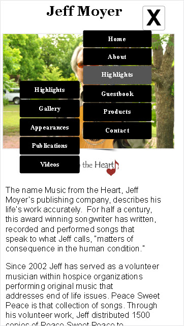
You can see that there is a Highlights item in the main menu and in the sub menu. The item in the main menu has no link assigned to it. This is to prevent going to another page and thus refreshing the menu back to its closed state. The item with the actual link to the Highlights page is in the sub menu instead.