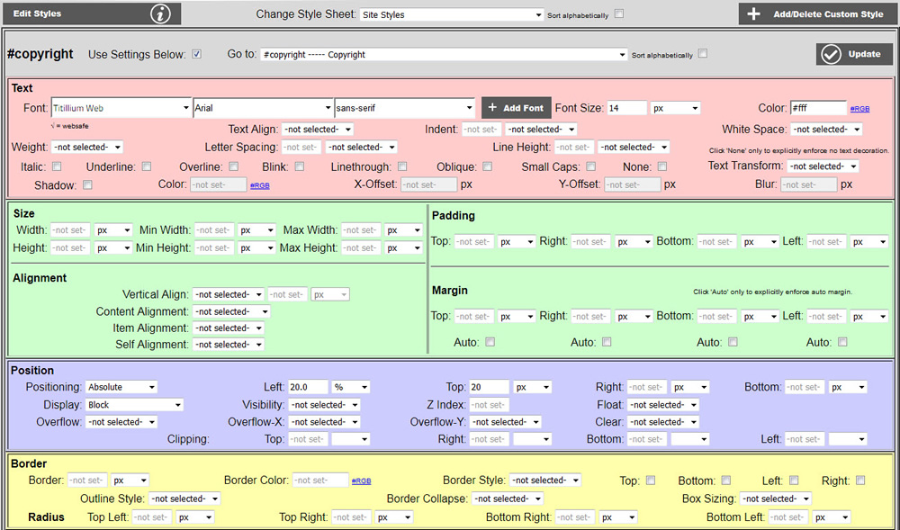

CSS (cascading style sheets) is designed primarily to separate document content from document presentation. CSS defines the presentation of your website content. This is accomplished by having identifiers in your content that reference the presentation styles in your CSS. There are two basic ways to link your styles to your content. One is through the id attribute of your HTML objects. The other is by applying a class to your HTML objects. Both of these methods can do most of the same things. Traditionally, these to methods differ is the following way: The id attribute of an HTML object is unique to that object, whereas a class is meant to be applied across many objects which you want to share a particular style. An example of HTML code utilizing the id attribute is: <div id="myid">. An example of HTML code utilizing the class attribute is: <div class="myclass"> In the style sheet, ids and classes differ by the prefix. A pound sign # signifies an id and a period . signifies a class. Styles may be applied to every standard HTML object on a page simply by style that object without any prefix, i.e. table. Below is the CSS editor with the #copyright id style selected:
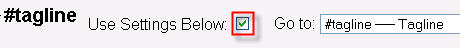
To select a class to edit click the Go to list and select the class you want to edit. If no styles have been assigned to that class, the form controls will appear disabled. To activate a class, click the Use Settings Below checkbox as shown below:
The CSS editor contains different blocks of options organized by function group. Some of these functions groups are text styles, background color, border and padding, margins and size, positioning, background image, and list styling.
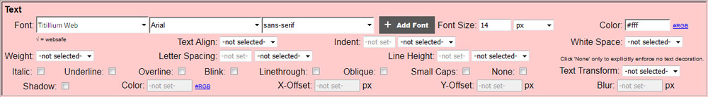
The text block primarily includes styling for text. Alignment may be use for other objects as well. Note that if you do not want an underline for linked text, you leaving the Underline checkbox is not enough to accomplish this. You must check the None checkbox. You will also need to create subclasses for link, hover, visited and active as well. Go to classes to find out more about sub classing.
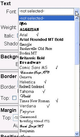
There is a wide arrange of fonts available. Note that not all of the fonts available are considered websafe. Websafe fonts are fonts that will display corrected across all computer platforms, Windows, OS-X, Linux/Unix, etc. Non-websafe fonts are those that may be available on Windows computers only. Because of this, it is recommended that you only use websafe fonts in your text. If you want to use a non-websafe font for logo or something else, it is recommended that you make sure a font file or a link to the fonts exists. Use the Manage Custom Fonts console to check. If not, you may use the Manage Custom Fonts console to upload a font file or add a font link. Websafe fonts are marked with a checkmark √. Part of the font list is shown below:
You may also add custom fonts in the form of an uploaded font file or a URL where to download the font (i.e. a Google font). Click on the  button to access the Manage Custom Fonts console. For more information on custom fonts go to Managing Custom Fonts.
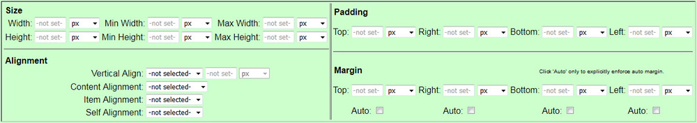
Shown below is the size, padding, alignment and margin styles group. Size includes height and width as well as min and max height and width. Units of px or % or any other CSS length unit may be selected for height and width. Note that margins may be positive or negative. -1000000 signifies no margin specified however. Paddings are always positive.
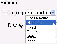
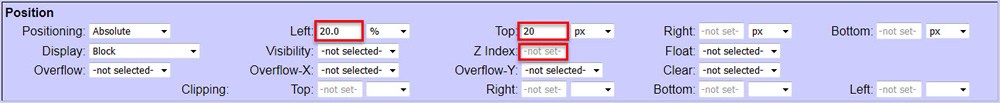
Shown below is the positioning style group.
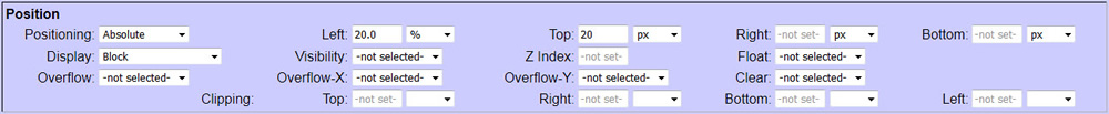
One use of this block is for floating objects into position on your page. Absolute positioning references your object from the absolute top-left corner of your page. Relative positioning positions your object from the point of where you object would be in on the page if no positioning is used. Go to http://www.w3schools.com/Css/pr_class_position.asp to find out more about position.
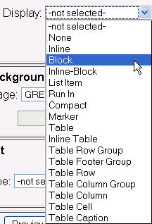
To float your object anywhere on your page, select display = block. Go to http://www.w3schools.com/css/pr_class_display.asp to find out more about display.
Next, fill in the left and top to position your object on your page. You may also want to fill in the z index with a positive number to ensure that this object remains on top of the objects that this object is floating over.
The border styles group is shown below. Note that you do not need to have a rectangular border around your object. You may check any combination of the top, bottom, left and right checkboxes to apply a border to any of these selected sides around your object.

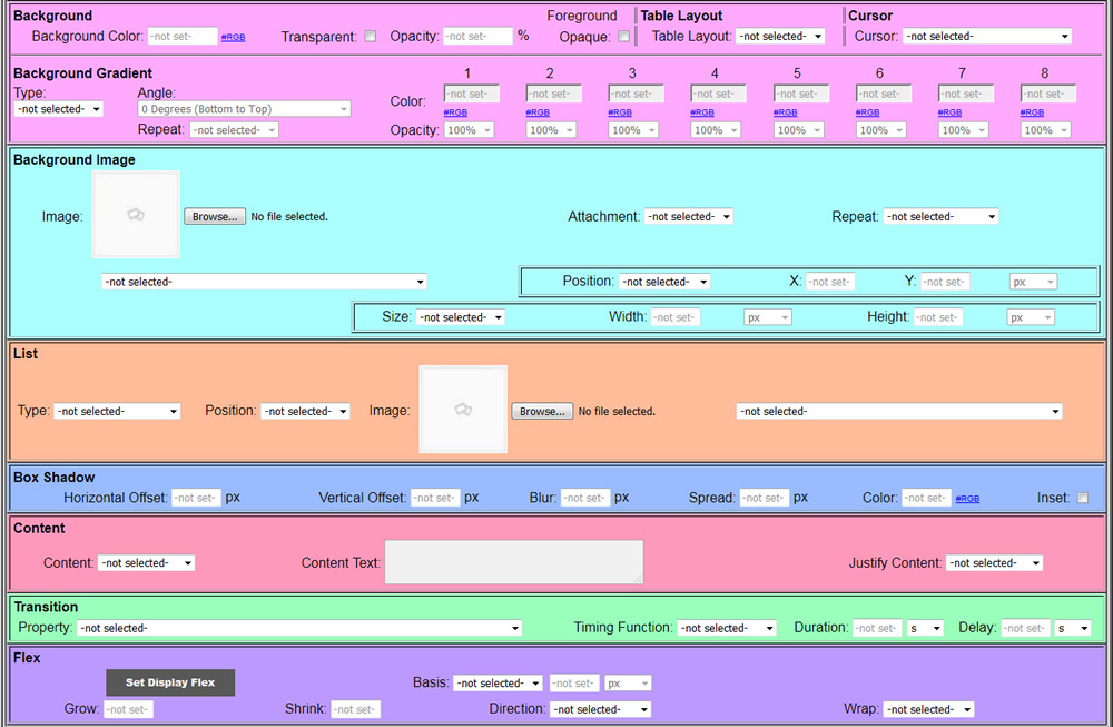
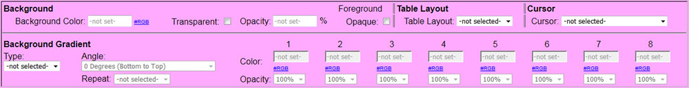
The background functions are shown below. Table Layout has no relation to background color and opacity, but it is included here because it does not belong any where as as well and there was plenty of space in this block. Cursor is tossed in this section simply because there was a space for it. Setting the cursor allows you to change the mouse pointer whenever anybody hovers the mouse over whatever object has the class with the cursor set assigned to it. The most popular choice is Pointer which usually indicates that
When Foreground Opaque is not checked, Background Color is the basic CSS1 background color and Opacity is the CSS2 opacity that makes the element and all of its children semi-transparent. An opacity of 100% is completely opaque, and an opacity of 0% is completely transparent. Checking Transparent disables background color and opacity. This will make the background completely transparent, but the text and any other child elements will be completely opaque. Checking Foreground Opaque implements the CSS3 background RGBA attribute. It bundles the background color with the opacity setting in one attribute. This is a nice feature because all of the child elements including any text will be fully opaque.
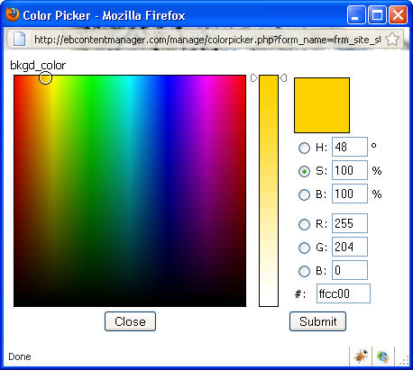
Anywhere color is asked for in the CSS editor, there is an #RGB link near the textbox. Clicking on this link will open a color picker as shown below. You may use your mouse to pick a color from the chart, and then click Submit and the RGB hex number will automatically be filled in.
Background gradients can be either linear or radial. A background gradient will take precedence over a plain background color; however, it is a good idea to specify both to have a fallback for older browsers that do not support gradients. You may specify the angle for linear gradients. This panel allows for each of the 90 degree and 45 degree angles as well as other angles in 10 degree increments. You must specify at least 2 colors. The colors may be the same color if the effect you are looking for it to merely go from opaque to transparent. You may also specify the opacity for any of the colors you pick. This console does not allow you to choose at what percent to break in the new color. Each new color will come in as an equal portion of the gradient. You may also specify the number of times you want the gradient to repeat throughout the area the gradient is applied to. Also note that repeated gradients are calculated to give each color equal weight.
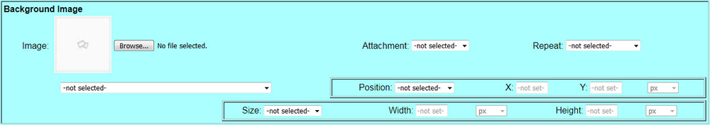
Shown below is the background image style group. You may upload your background image using the Browse and Upload buttons. Then select your image from the list. You may also enter a URL for an image on another website if you wish.
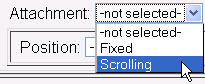
Typically, you will want to select scrolling. Scrolling really means that the background image scrolls WITH the page. Fixed means the background image remains in positions AS you scroll the page over it. Fixed will actually give the appearance of "scrolling".
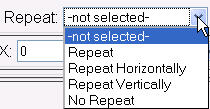
You can choose to have your background repeat horizontally, vertically, both or no repeat. To have your background repeat both horizontally and vertically, select repeat.
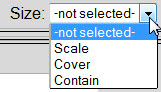
You can also specify the background image size. You may choose Scale to use scale the background image to the height and width you specified. If you leave height or width unset (-1), the unspecified dimension will proportionally scale according to the set dimension. You may also select % instead of px for the height and width units. Selecting Cover will ensure that the background image fills the container. The height or width of the image may be cropped by the container size. Selecting Contain fills the container to up to the point where height or width reaches container size such that the image will not be cropped by the container. In this case, some of the container may not be covered by the background image depending on if the aspect ration of the background image is the same as the container.
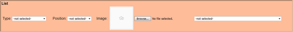
Shown below is the list style group. This is used for styling ordered lists (with numbers) and unordered lists (bullet points).
Shown below is the box shadow style group. You may specify vertical and horizontal offsets, blur, spread and color of your box shadows around any object that you assign this style to. Checking the Inset checkbox allows you to have the box shadow internal to your object allowing to create interesting special effects.
The content area allows you to set content from within CSS. Only String, URL and Attribute will allow you to type into the Content Text box. This can be used in conjunction with flex for responsive web design.

The transition area allows you to set transititions (animations) various elements in the window. At this time only Width, Height, Width and Height, Font Size or All may be selected for transition. The timing function allows you to set the "curve": linear, slow start, fast start, fast start and fast end with slow in middle. Transitions can be used in conjunction with flex for responsive web design.
The flex area allows you to specify size changes for different screen sizes for responsive web design. Clicking the Set Display Flex actually sets the display attribute in the position area above.

Adding New Classes
The button shown below is used for adding (or deleting) custom classes. You can also create sub classes which is merely linking two or more classes together to combine styles on HTML objects. Go to classes to find out more about creating and managing classes.
Page Centering
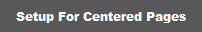
By default your site will align towards the left of the browser window. To have your site center in the browser window, click the Setup for Centered Pages button. You may also want to revise the 'body' width, the 'body' background color, and the '#wrap' background color to your needs. To do this, select the body class and change background color and width, and select the #wrap class and change your background color. The body background color is the color outside of your page content. It does NOT include the top, bottom and side border areas. The #wrap background color includes the content area and the border areas.
Sticky Footers
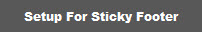
Clicking the Setup for Sticky Footer button will automatically setup your footer area to go to the bottom of the browser window even if your content does not fill the entire browser window height. Due to variances is website designs, it could take some tweaking to get this to work correctly on your site.
Managing Important CSS Attributes
It is generally considered bad practice to use the CSS directive !important. But if you are backed into a corner and need to use !important, you can do so with the Manage Important CSS Attributes console. Click on the butt as pictured above to access this console. For more on using this console, go to Managing Important CSS Attributes.
Loading Browser Reset CSS
Browsers tend to add a little space around things by default if not otherwise specified. For example, you will probably see a gap of approximately 8 pixels between the first element on your website and the very top of the browser window. Because of this and other issues web designers run into, it is considered good practice to load what is know as "browser reset" CSS before loading any other styles. The Breeze includes a very simply set of styles for "resetting" your browser display settings. Simply click the Load Browser Reset CSS button to populate the browser_reset.css file. If you want to add more reset styles, you can do that by selecting Browser Reset Styles in the style sheet list under Change Style Sheet at the top of this console.