The Breeze Website Builder™ is relatively easy to use for building websites. Using the wizard to start makes creating your website a snap. After running the wizard you may add content, change colors, upload images and customize your website any way you like. But in many case, you may want a completely custom website that is not available through the wizard. The section will cover the basic steps for building a website from scratch.
Despite the intuitive interface of the Breeze Website Builder™, you will find that HTML editing still does not compare to the ease of use of dedicated word processors or desktop publishers. Because of this, it is recommended that you have a clear idea of your design. A mockup done in a graphics design program such as PhotoShop® is highly recommended. By performing this step first you will save yourself many hours of changes to CSS and layout.
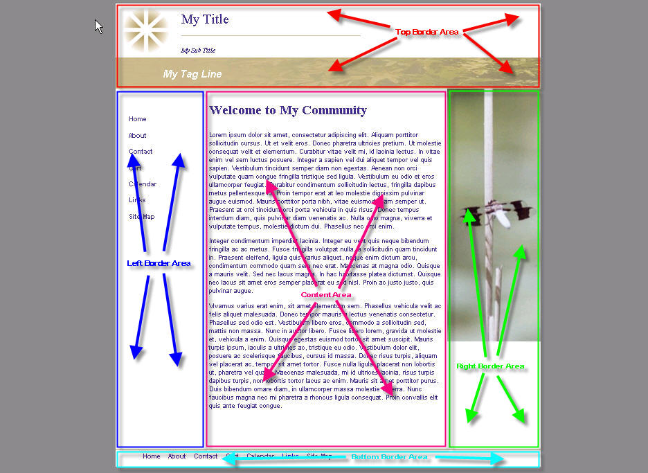
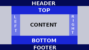
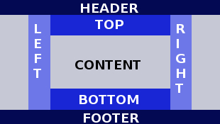
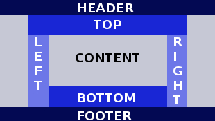
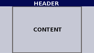
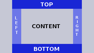
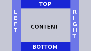
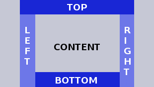
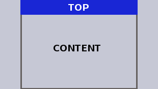
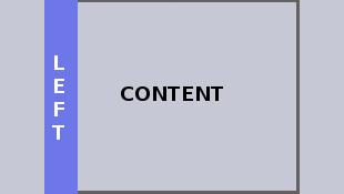
To start, you must know the basic layout of your site. By this, we mean what parts of your pages are the same on all of the pages. We call these areas border areas as they are located along the borders (header, footer, top, bottom, left and right) of the page. Most websites have a header and/or top and a left area. Many websites will also include a footer and/or bottom area and some websites will have a right border area. (Note: If your design requires different border areas for different pages, this can be accommodated in the system. Many websites use different information on each page for the right border area. How to do this will be discussed later.)
The possible combinations for the border area are as follows:
 |
 |
 |
 |
 |
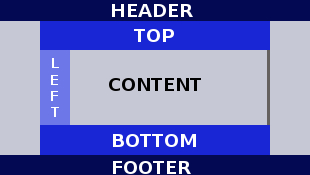
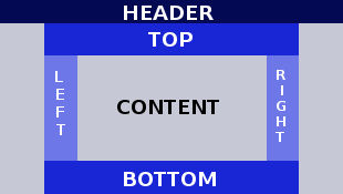
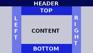
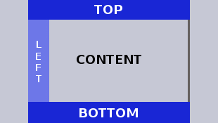
Head Footer Top Bottom Left Right |
Head Footer Top Bottom Left Right (alternate) |
Header Footer Top Bottom Left Right (alternate 2) |
Head Footer Top Bottom Left |
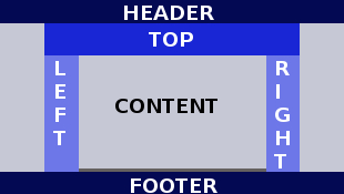
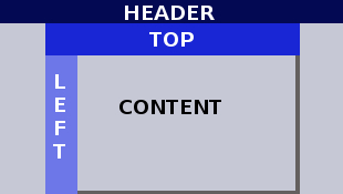
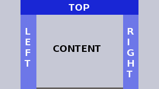
Header Footer Top Left Right |
 |
 |
 |
 |
 |
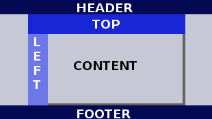
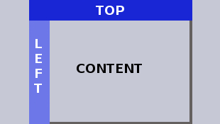
Header Footer Top Left |
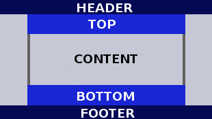
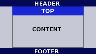
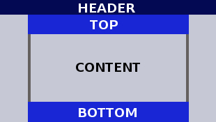
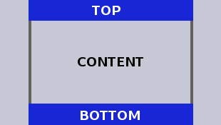
Header Footer Top Bottom |
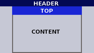
Header Footer Top |
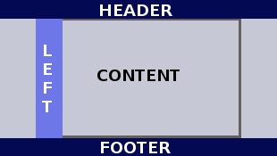
Header Footer Left |
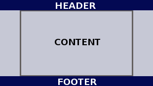
Header Footer |
 |
 |
 |
 |
 |
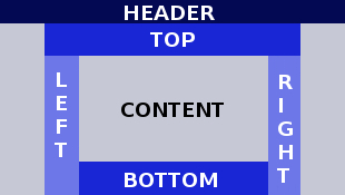
Header Top Bottom Left Right |
Header Top Bottom Left Right (alternate) |
Header Top Bottom Left Right (alternate 2) |
Head Top Bottom Left |
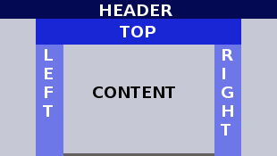
Header Top Left Right |
 |
 |
 |
 |
 |
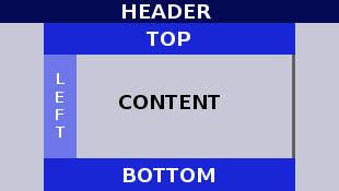
Header Top Left |
Header Top Bottom |
Header Top |
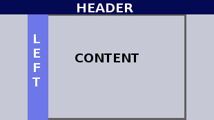
Header Left |
Header |
 |
 |
 |
 |
 |
Top Bottom Left Right |
Top Bottom Left Right (alternate) |
Top Bottom Left Right (alternate 2) |
Top Bottom Left |
Top Left Right |
 |
 |
 |
 |
 |
Top Left |
Top Bottom |
Top Only |
Left Only |
Basic (no border areas) |
Choose the border layout that matches your design. Then click on the Manage Users and Site Options button in the main menu. Click on the Change Site Options link. Select your layout from the template list and click Submit. This will make your selection the default whenever you create a page. Note: The Basic layout with to borders is often useful for "splash" page if you want to have one. There is a basic class included with the default classes so that you may apply different body CSS to the body of your splash page from the rest of your pages. Also note that you may override the default layout selection any time you create a page simply by selecting a different layout upon creating your page.
Selecting page alignment
At this point you will probably want to click the fast-setup button for setting your site up to be centered on the page. You don't have to have a centered site, but most websites are. Otherwise, your site will appear bunched up to the left and high-resolutions monitors when the browser window is at or near full screen width. An exception would be if you design your site such that the content automatically widens to fill the browser window. This takes extra skill in website design and graphic artists don't like this because they tend to think of a site being scaled to a particular size, but you could build your site this way in this system. Below are examples of these two types of sites:
Centered Page (Width remains fixed, page always floats to center of browser window space permitting. Note background area on left and right.)
Left Aligned Page (Page is aligned left in browser window. Page width increases with browser-window width until full page width is displayed, then aligns left leaving right of page empty.)
Note how text collapses as browser-window width is decreased.
To create a centered site, click the Edit Styles button on the main menu. Select Site Styles from the list and click Edit. The CSS editor will open. In the CSS editor, click the Setup for Centered Pages button.
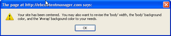
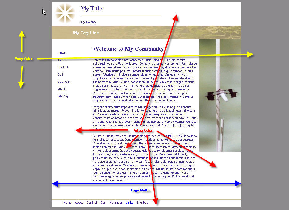
Upon completion the above message will be displayed. This message mentions a couple of adjustments that you might want to make. For example, the default width is set to 900px, and the background color of the body is set to gray, and the background color of the wrap is set to white. See example page below for illustration of terms:
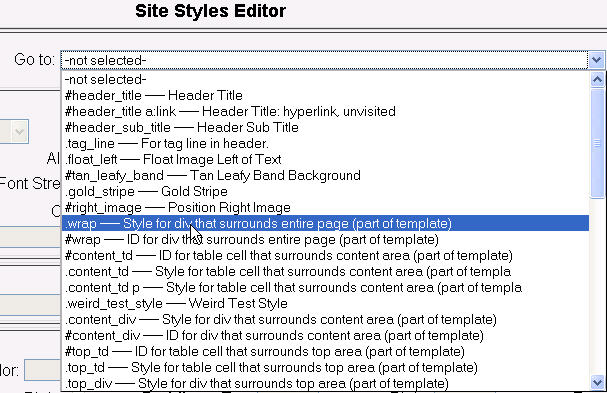
To change the #wrap attributes, select the #wrap class from the Go To list:
You can change the page width by changing the width as shown below:

You may want to get the page width directly from your mockup. If you do not know the width of your mockup, you can download a screen ruler tool to do this. Go to our useful downloads section to find a screen ruler.
Likewise, you can change the wrap color as shown below:

Clicking the #RRGGBB link will bring up a color picker:
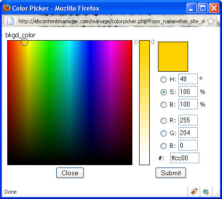
You may want to get the color directly from your mockup. If you do not know the hex color code, you can download a color picking tool to do this. Go to our useful downloads section to find a color picker to grab the code for you.
Setting up border areas
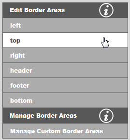
The next step is to put the content you want in the border areas. Editing the border area content uses the same editor as Editing the page content itself. Go to Editing pages to find out more about using the editor. To select the border area you want to edit, click the Manage Border Areas button in the main menu, then select one of the borders areas as shown below:
You may also add additional top, bottom, right or left border areas and assign the to pages of your choice. Go to managing border areas to find out more.
Adding and styling menus
Looking at your mockup, determine where your menu(s) are to be placed. Typically, the main menu for a website is either a horizontal menu across the top, or a vertical menu across the bottom. For the horizontal top menu, you would assign a menu to the top border area, and for the vertical menu towards the left, you would assign a menu to the left border area. You can assign one menu to each border area, up to four menus on a page. (You can even assign the same menu to two different border areas on the same page, but this makes no sense.) Many websites have links across the bottom. We recommend you use a CSS menu for this as well. You can create as many menus as you want. We recommend that you use the CSS menu system instead of the JavaScript menu system, if your customers are predominantly corporate, as many corporate networks have JavaScript turned off as a security policy. In this situation, the JavaScript menu won't work at all, but the CSS menu is designed to run completely without JavaScript.
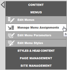
In the main menu, click the Manage Menu Assignments button to display the menu assignment links as shown below. Go to managing menu assignments to find out more about assigning menus.
Next you will need to add a least a few menu items to your menu(s). You will need a couple of menu items to perform the next step which is styling. Click the Revise Menu button in the main menu. This will take you directly to the menu editor. Start by selecting the menu you want to edit as assigned above. Go to Editing menu items to find out more about using the menu item editor.
Finally, you will need to set menu parameters and styles for each of your menus. The menu parameters must be set first before you can set the styles. Menu parameters include menu type (horizontal or vertical), position on page, menu item and submenu item size, submenu offset from main items, and proportional vs. fixed spacing. Menu styles include font face, size and color, background colors, border colors and drop shadow effects for both menu and submenu items for mouse out, hover and click events. In the main menu, click the MENUS button to display the menu styling links as shown below:
Go to the links below to find out more about positioning and styling menus: